
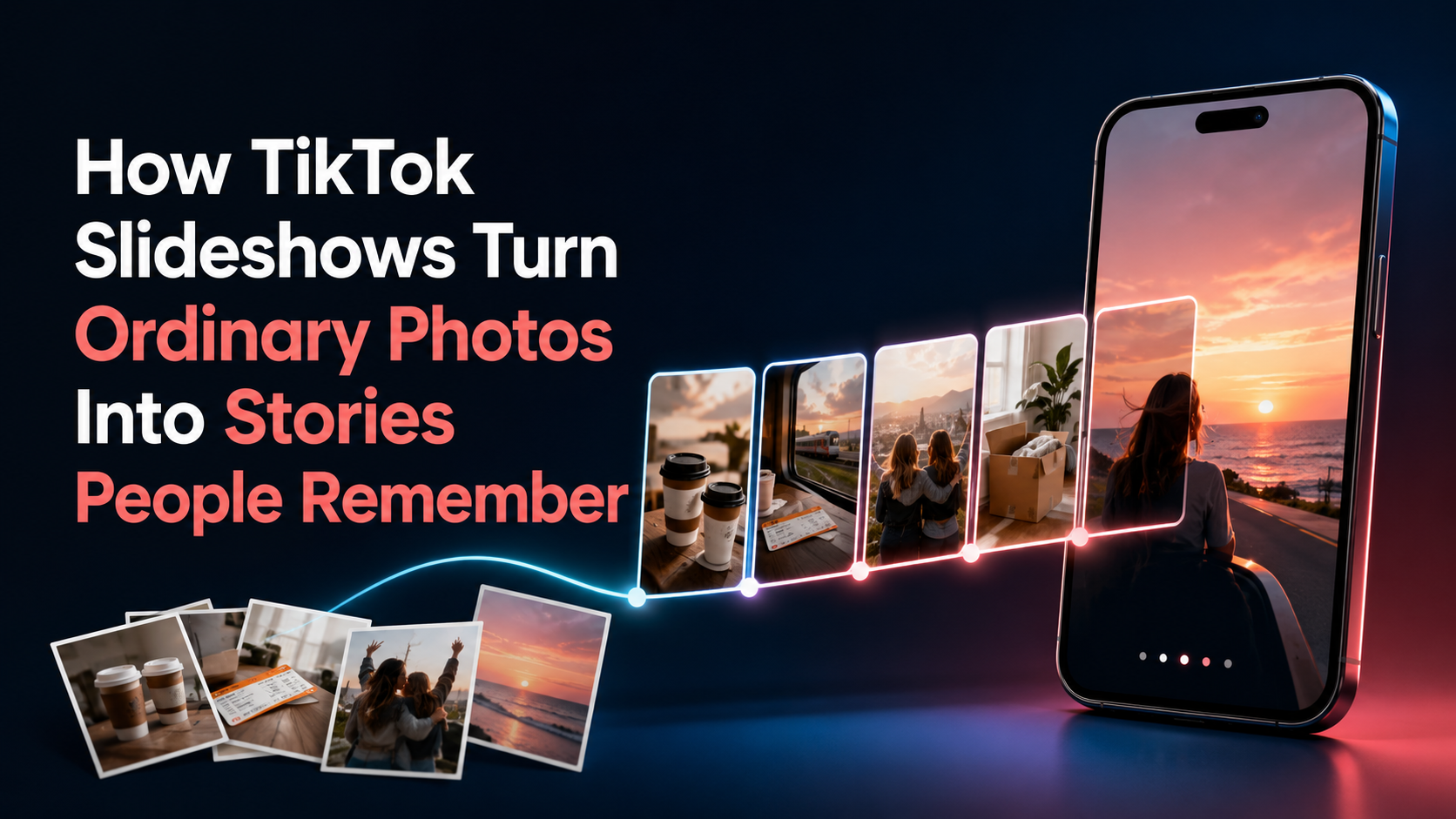
Open TikTok and you’ll eventually come across a slideshow that begins with something completely ordinary. Maybe it’s an old bus ticket, a badly lit bedroom or a picture of two coffee cups on a table.
Nothing special. At least not yet.
Then you swipe and the meaning starts to change. The empty room belongs to someone who has just moved out. One of the coffee cups belonged to a friend who no longer lives nearby. That old ticket was kept because of what happened during the journey.
The individual pictures may not be impressive, but once they’re placed together, they begin to feel like parts of a story. This is what good TikTok slideshows often get right. They don’t rely on every photo being perfect. They make people curious about how the photos are connected.
A Slideshow Lets the Viewer Fill in the Gaps
Videos usually explain a lot. Someone speaks, captions appear and scenes move forward at a pace chosen by the creator.
Slideshows leave more room for the viewer.
If one photo shows an open suitcase and the next shows a nearly empty apartment, you can probably guess what’s happening. Nobody needs to write, “I was moving to another city.” You’ve already started working that out.
That small amount of guesswork makes the post more involving. Instead of being told every part of the story, the viewer joins the pictures together.
Of course, leaving out too much information can make a slideshow confusing. There’s a difference between creating curiosity and expecting strangers to understand a private memory without any context. Usually, one short sentence is enough to point people in the right direction.
The creator gives the clue. The viewer makes the connection.
The First Photo Has to Create a Reason to Swipe
The opening image doesn’t always need to be the prettiest one. In many cases, a slightly unusual photo does a better job.
Consider a picture of a cracked phone screen. By itself, it isn’t particularly interesting. Add the words, “This saved me from missing my flight,” and suddenly there’s a question. How could a broken phone help anyone?
That question is the hook.
Vague opening lines tend to be weaker because they don’t give the viewer anything solid to think about. “A day I’ll never forget” could refer to almost anything. “The hotel called us five minutes after we checked out” gives the story somewhere to go.
Specific details feel real. They also help the viewer decide whether the post is worth following.
This doesn’t mean every opening needs to sound dramatic. A cooking slideshow could start with a photo of the finished meal and a simple line such as, “I made this with what was left in the fridge.” A room makeover might begin with the final result. A personal post may start with an old photograph and a date.
The first slide only needs to create enough interest for one more swipe. After that, the next image has to take over.
Photo Order Matters More Than People Think
A camera roll stores pictures by date. A good slideshow doesn’t always need to follow that order.
Suppose someone is sharing the process of repairing an old bicycle. They could begin with the damaged bicycle, show the repairs and finish with the first ride. That gives the viewer a clear beginning, middle and end.
Or they could start with the finished bicycle and then reveal how rusty it looked a week earlier. In that version, the result becomes the hook.
Neither approach is wrong. The better choice depends on what is interesting about the post.
If the transformation is the strongest part, showing it early may stop people from scrolling. If the result contains a surprise, saving it for the last few slides makes more sense.
Things become awkward when the photos are arranged without considering what the viewer knows. The creator may understand why a particular image is important, but somebody seeing it for the first time does not have the same memory attached to it.
A useful check is to look at the slideshow without its caption or music. Does the sequence still make basic sense? If two slides were swapped, would the story be clearer? Does one photo reveal the ending too soon?
Often, the problem isn’t the quality of the pictures. It’s where they have been placed.
Polished Photos Aren’t Always the Most Memorable
Some stories need clean, attractive images. A fashion slideshow, for example, should allow people to see the clothes properly. Travel posts also benefit from sharp landscape photos.
Still, a personal slideshow made entirely from polished photographs can sometimes feel distant.
The less-perfect images tend to show what an experience actually looked like. A blurry picture may capture someone laughing. A screenshot could show the message that changed the day. An untidy room may explain the situation better than the carefully arranged “after” photo.
These images don’t work because they’re low quality. They work because they add something true to the sequence.
There’s obviously a limit. If a photograph is so dark that nobody can see what’s happening, it won’t help. But creators don’t need to remove every photo that looks a little rough around the edges.
Sometimes the imperfect picture is the one that makes the rest of the slideshow believable.
Too Much Text Can Get in the Way
Text is often necessary. A viewer might need to know where a photo was taken or why an object in the picture matters.
But there’s only so much people want to read on a phone screen.
Large blocks of text can cover the important part of the image. They also interrupt the pace because the viewer has to stop and read a full paragraph before moving on.
Breaking an explanation into smaller parts usually feels more natural:
“I found this camera at a flea market.”
“The owner said it hadn’t worked in years.”
“When I opened it, there was still film inside.”
“These were the pictures on it.”
Each line gives the viewer one new detail. The story moves forward without turning the slideshow into a page of tiny writing.
There’s no need to put text on every image either. If the photograph already makes the point, let it do the work.
Knowing Which Photos to Remove
Choosing pictures can be harder than taking them. The creator remembers what was happening in each one, so every photo feels different.
Viewers don’t see those memories. They only see what is on the screen.
If four images show the same meal from almost the same angle, most people won’t experience them as four separate moments. They’ll simply wonder why they’re still looking at the same plate.
Every slide should introduce something, even if that something is small. It may show progress, reveal a new detail or change the mood. A quiet image can be useful too, particularly before an important final slide.
But if removing a picture makes no difference to the story, it probably doesn’t need to stay.
A shorter slideshow isn’t automatically better, yet it’s usually easier to finish when there are no filler images.
Music Quietly Changes the Story
The same collection of photographs can feel warm, sad or funny depending on the audio behind it.
Think about a group of childhood pictures. Soft music may make them feel nostalgic. A playful song could turn the same photos into a lighthearted post about old hairstyles and questionable fashion choices.
Music gives viewers an emotional hint before they have fully understood the pictures.
This is why a trending sound isn’t always the best sound. Popular audio can help a post feel current, but it may also feel out of place. A quiet story can lose its impact if the music is too loud or energetic.
The most suitable audio is often the one that matches the natural mood of the photographs.
It can also help when a noticeable beat or change in the music lines up with an important slide. That might be the finished makeover, an unexpected screenshot or the image that explains the entire post.
The viewer may not consciously notice the timing. They’ll probably feel it, though.
Studying the Images Without the Distractions
A successful slideshow can appear effortless when you watch it normally. The photos move, the audio plays and the post feels like one complete thing.
Looking at the images separately tells you more.
You begin to notice that the first slide raises a very specific question. The second gives only part of the answer. A later photo changes the mood, while the final image connects back to something shown at the beginning.
If you’re studying a public post, the TikTok slideshow downloader from TikGrabs can separate its images and audio. This allows you to examine the order and text placement without repeatedly pausing the slideshow.
It isn’t about copying somebody else’s post. Their story, photographs and audience are different from yours. What you can study is the thinking behind the sequence.
Where did you first become curious? Which image gave you new information? Was there a slide that felt unnecessary? Why did the ending work?
Those questions are more useful than simply counting how many photos the creator used.
A Slideshow Needs Somewhere to Finish
A slideshow can start well and still feel disappointing if it doesn’t have a proper ending.
Sometimes the last image appears to have been chosen only because it was the final photo in the creator’s gallery. It doesn’t answer the opening question or show what changed.
A satisfying final slide gives the viewer a reason to be glad they stayed.
For a makeover, that may be the completed room. For a personal memory, it could be a recent photograph showing where the people are now. A funny post may save the worst mistake or most unexpected result for last.
The ending doesn’t always need an explanation. In fact, a simple photograph with one short sentence often works better than a long conclusion.
“We still meet there every year.”
“I never found out who took the photo.”
“She kept the ticket too.”
A small ending can carry a surprising amount of weight when the earlier slides have prepared for it.
Ordinary Events Can Still Make Good Slideshows
Not every story needs to involve a major life change.
Making dinner with the last few things in the cupboard has a beginning and a result. So does cleaning an old pair of shoes, rearranging a desk or trying to take a decent family photograph.
The event itself may be ordinary. What matters is whether something changes from the first slide to the last.
A problem gets solved. An object looks different. A question receives an answer. Someone changes their mind.
That movement gives the slideshow its shape.
The best approach is usually to start with the pictures that matter and remove the ones that don’t. Add context where the viewer genuinely needs it. Then choose an ending that feels connected to the opening.
There’s no complicated formula behind it.
Common Questions About TikTok Slideshows
Why do people keep swiping through a slideshow?
People continue when each slide adds information, raises another question or shows visible progress. If several pictures repeat the same idea, there is less reason to keep going.
Should the best photo be used first?
Use it first if it immediately shows why the post is interesting. If the photo reveals a surprise or completes the story, it may work better near the end.
Does every picture need a caption?
No. Captions are useful when viewers need context, but clear images can be left alone. Adding unnecessary text may cover details and make the post feel crowded.
How many pictures should be included?
There is no perfect number. Include enough photos to make the story clear, then remove images that repeat information or delay the result.
Can blurry or imperfect photos be used?
Yes, provided viewers can understand them. An imperfect image may add honesty, emotion or context that a polished photograph cannot provide.
The Main Idea
A TikTok slideshow becomes memorable when the pictures feel connected rather than collected.
One image opens the story. The next gives the viewer something new. Gradually, the meaning becomes clearer. By the last slide, there should be a result, an answer or at least a feeling that the post has reached the right place.
The technical side is simple. Choosing the right moments is not.
That is what separates a random group of photos from a slideshow people actually remember.